Jaguar announced today a bold new approach to their brand image that focuses on Exuberant Modernism, a concept they describe as “a creative philosophy that defines all aspects of the new Jaguar world”.
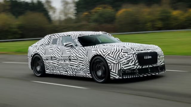
This philosophy will culminate at Miami Art Week, on December 2nd, when Jaguar presents “Copy Nothing”, a public installation which will showcase Jaguar’s new Design Vision Concept.
Symbols of change represent Jaguar’s fresh identity and hint at things to come
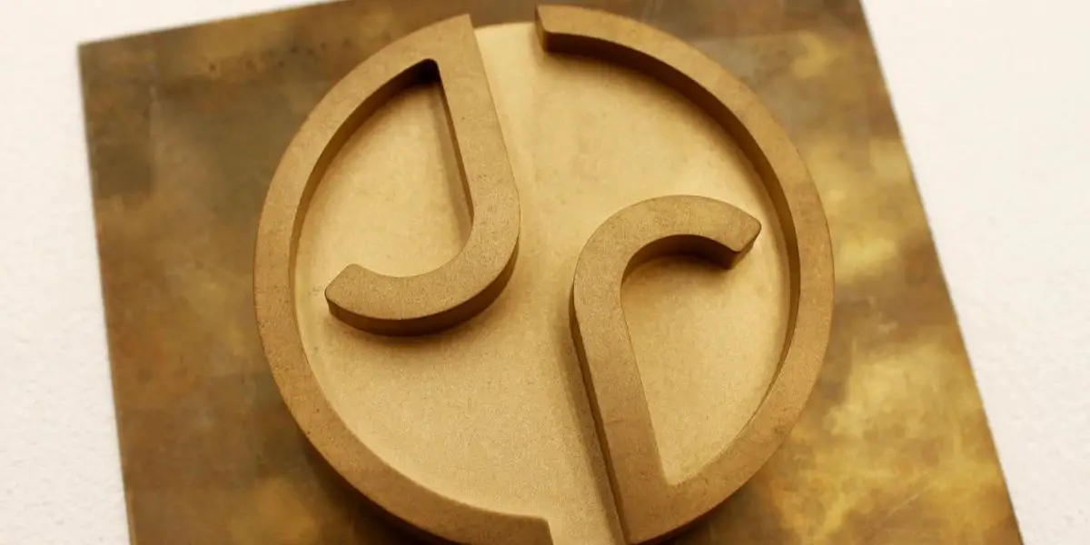
Showcasing the brand’s new identity will involve “symbols of change”. Jaguar claims their rebranding strategy follows the vision of its founder, Sir William Lyons, in its pursuit of originality. A series of logos, emblems, and symbols provided by Jaguar tease the upcoming showcase in Miami and the general aesthetic that its branding will follow.
Jaguar’s press release is intentionally vague and ominously hints at the direction the brand is headed. Unsure of the final destiny of the symbols and themes portrayed, let’s take a look at what Jaguar wants us to see thus far.
“The Jaguar brand’s new device mark is its signature”
Jaguar’s favourite new font takes on a modernist style, employing “geometric form, symmetry, and simplicity – demonstrating the unexpected by seamlessly blending upper and lowercase letters in visual harmony”. Whatever that means, it certainly gives the text a clean look, even if it does read as “JaGUar” when typed out.
Unexpected is definitely the correct word to describe this new approach to Jaguar’s branding, but there’s no denying its use of modernist influences.
Teasing us with ominous symbols, Jaguar claims that each visual provides clues for what is to come from the brand. We won’t know for sure what they indicate until Jaguar’s instillation at Miami Art Week on December 2nd, but these visuals give us a sense of the direction they’re headed in terms of style and aesthetic.
The Jaguar leaper has been synonymous with the brand for almost a century
Silver leapers have donned the hoods of Jaguars since 1936. Reimagined with modernist styling, the leaper is “a representation of excellence and a hallmark of the brand”, according to Jaguar. We are glad to see that the famous leaper lives on and are excited to discover how it will be incorporated onto future Jaguar products.

With Jaguar recently announcing that UK buyers will have to wait until 2026 for new products, the company’s rebranding strategy has a lot riding on it. It is no secret that Jaguar has been struggling financially and this attempt to drastically alter their image could either save the brand or alienate its already dwindling clientele even further.
The survival of Jaguar’s future rests on the shoulders of this bold Hail Mary decision
Only time will tell how this rebrand approach plays out for Jaguar. For an automaker that has long excited buyers with supercharged V8s, tire-smoking rear wheel drive sport sedans, Touring Car Championship winning V12 luxury coupes, and some of the world’s fastest ever production cars of their respective eras, switching their approach to exclusively offer electric vehicles is, in itself, a decision that has drawn much skepticism.
Microsoft Debuts Windows 365 Link: A $349 Mini-PC for Seamless Cloud Computing
Through Jaguar’s “Exuberant Modernism” rebranding strategy, the brand signals to buyers that the time has come for its beloved combustion-powered brutes to die. No one enjoys seeing something they love disappear forever, but Jaguar hopes that gimmicky new fonts and bright, flashy colours will soften the grieving.


